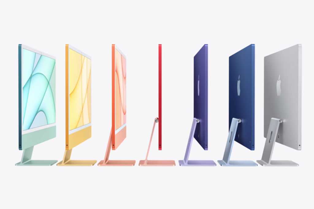
There’s no denying that the new 24-inch M1 iMac is an awesome machine. A tremendous upgrade over the previous generation, it finally injects some much-needed excitement into Apple’s consumer desktop line and sets the stage for what the iMac will be for years to come. But Apple can’t go another decade without making a few meaningful changes to the new model. While we absolutely recommend buying one right now over any other iMac, the new model didn’t quite live up to our admittedly lofty expectations. Here are six ways the 24-inch iMac still falls short:
The M1 chip is just OK
As expected, the new iMac got a dose of Apple silicon, and we have no doubt that it’ll be insanely fast, especially compared to the previous Intel Core i3 model. But while we were hoping for an upgraded system-on-chip with higher RAM allotments and higher speeds, we got the same M1 chip that’s in the MacBooks, right down to the 7-core and 8-core GPU options. That’s probably enough for these iMacs, but Apple is going to need more processing and graphics power, not to mention more memory, with the higher-end iMacs.

Apple
The display isn’t adjustable
The M1 iMac’s 4.5K retina display is certainly a great one, with a P3 wide color gamut, 500 nits of brightness, True Tone, and an anti‑reflective coating. It’ll be amazing for watching movies, editing videos, and staring at it for hours on end. The problem we have is with the adjustment. Like the iMacs of old, you can tilt the display to get an optimal viewing angle, but you can’t raise or lower it to match the height of your desk. That was a major limitation of the old iMac—and why it spawned a cottage industry of risers and stands—and we can’t believe Apple did it again.

Apple
It doesn’t have a killer feature
The M1 iMac is certainly a great computer, but it doesn’t really do anything the previous model didn’t do. The magnetic power cord is a nice touch, but it’s not really adding anything to the experience. We would have loved a wow factor—a wireless charging pad built into the base, a detachable screen, Apple Pencil support—to make a machine we want into one we have to have. The M1 iMac is certainly a nice machine, but when you boil it down, it’s really just an iMac.
The design doesn’t go far enough
When you first lay eyes on the new iMac, it’s certainly striking. The colors, the skinny bezels, the minimal aesthetic are all lovely, but when you take a step back, it’s not all that different than the model it replaced. Our biggest issue is with the chin. Since Apple made the iMac so incredible thin (just 11.5mm) it still needed to put the logic board below the screen. So while there’s less empty space and it’s more colorful, there’s still a chin below the screen, except now there’s no Apple logo to break it up. And while we’re at it, we’re not sure why Apple opted for distracting white bezels rather than black ones.

Apple
The ports are very lacking
Apple has been on a crusade against ports on the iPhone and MacBook, and now it’s come to the iMac as well. However, while we understand why Apple would take away ports from its portable devices to make them lighter and thinner, it makes a lot less sense on the iMac. But Apple did it anyway. The previous model had four Thunderbolt 3 (USB-C) ports, four USB-A ports, gigabit Ethernet, and an SDXC card slot, but the new model has just two or four USB-C ports, with ethernet built into the power adapter on the upper models. That means you basically need a hub or dongle to connect any older accessory, which needn’t be the case.

Apple
It doesn’t have Face ID
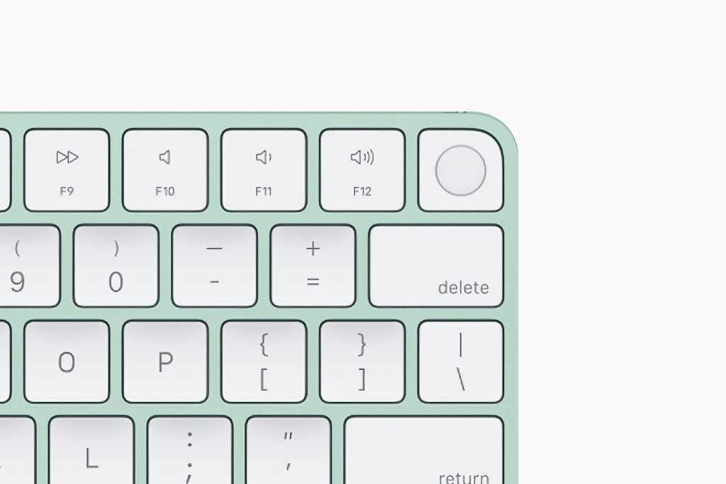
Touch ID on the Magic Keyboard is something we’ve wanted for years, and we’re glad to see it come to the iMac (and we hope Apple lets us buy one separately soon). But we can’t help but see it as a missed opportunity to bring Apple’s simpler, more secure biometric authentication to the Mac. When we heard the iMac was finally getting an upgraded 1080p front camera, we thought for sure that we were getting a TrueDepth camera for Face ID, but nope, we’re still waiting for it to make its way to a non-iOS device.


