When I first heard about hew new Focus feature in iOS 15, iPadOS 15, and macOS Monterey, I was impressed. I wanted to love the feature. I gave it a fair shot. But after some time, I think it’s actually the opposite of what we need. Making it so our iPhones and Macs beg for our attention less often is terribly important, but nobody’s going to be willing to do any work to make that happen.
We already have notification controls, and the vast majority of people don’t use them. Giving us a bunch more controls, even if they technically work better, isn’t the answer.
Notification overload
Notification overload is a real problem with smartphones. It’s one of the reasons we’re glued to our phones too much…they’re constantly dinging, vibrating, lighting up, screaming, “Look at me! Look at me! You got a Like! You got a reply! Your gems have replenished! 200 people looked at that thing you posted!”
Every app wants you to use it as much as possible, so they’re incentivized to bug you as often as possible so you pick up your iPhone and, hopefully, open the app. It’s ruining our attention spans and making us addicted to the dopamine drip of attention and gratification these apps can give us.
But it’s also ruining our entire iPhone experience. Your average lock screen is full of notifications of all sorts. From “you left your car door open” to “it’s time to get back to that freemium game you were playing.” It’s not only overwhelming, it’s almost dangerous. You either pay attention to every notification and go crazy, or you tune them all out and miss actual important events.
To paraphrase from The Incredibles: When every notification is important, none of them are.
Too much effort
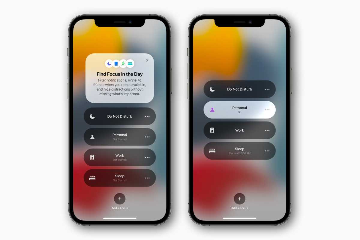
Apple’s solution to notification overload in iOS 15 is twofold: Notification Summary and Focus. They’re good ideas in a vacuum, but in practice they ignore the first rule of usability in a broad user base: people rarely change anything from the default.
 https://b2c-contenthub.com/wp-content/uploads/2021/07/ios15-focus-mode.jpg?resize=300%2C200&quality=50&strip=all 300w, https://b2c-contenthub.com/wp-content/uploads/2021/07/ios15-focus-mode.jpg?resize=768%2C512&quality=50&strip=all 768w, https://b2c-contenthub.com/wp-content/uploads/2021/07/ios15-focus-mode.jpg?resize=1200%2C800&quality=50&strip=all 1200w, https://b2c-contenthub.com/wp-content/uploads/2021/07/ios15-focus-mode.jpg?resize=1536%2C1024&quality=50&strip=all 1536w, https://b2c-contenthub.com/wp-content/uploads/2021/07/ios15-focus-mode.jpg?resize=2048%2C1365&quality=50&strip=all 2048w, https://b2c-contenthub.com/wp-content/uploads/2021/07/ios15-focus-mode.jpg?resize=1240%2C826&quality=50&strip=all 1240w, https://b2c-contenthub.com/wp-content/uploads/2021/07/ios15-focus-mode.jpg?resize=150%2C100&quality=50&strip=all 150w" width="1200" height="800" sizes="(max-width: 1200px) 100vw, 1200px" />
Apple
You may have been prompted to enable Notification Summary (a good start) but if you don’t go into Settings and tweak which apps you want to go through and which should get caught up into the summary, it doesn’t do much good. You’ll get too many notifications at once and miss timely ones for hours, and how many of the billion-plus iPhone users will put in the work to get it right?
And on macOS Monterey, there isn’t even a Notification Summary, even though notifications have just about the same settings as in iOS 15. Granted, notifications aren’t as intrusive on the Mac as they are on an iPhone, but Notification Summary is still a feature that should be on all devices if Apple is serious about getting people to use it. It makes the whole system feel half-baked and less like an ecosystem-wide experience.
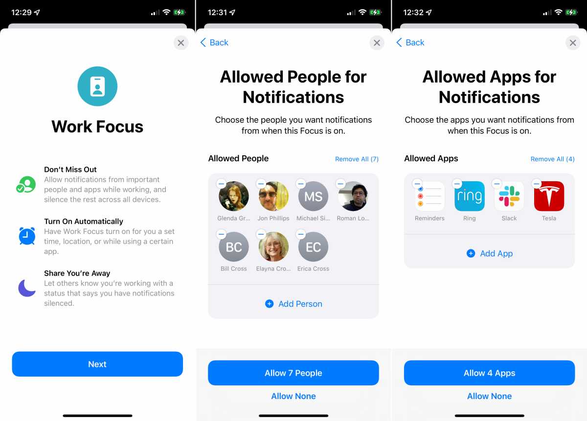
Focus is worse. There are multiple different modes for different activities (sleeping, driving, working, exercising, whatever) and you’re supposed to go through each one and decide which people and apps you want to get notifications from, and what triggers the mode, and even change settings for the lock screen and home screens? Even something relatively simply like Sleep is something of a chore, with numerous options to choose from.
Yikes. All that flexibility is great for control freaks, but likely less than one percent of iPhone users are going to go through the trouble.
A smarter way to focus
So what’s the solution? Apple is unlikely to get rid of Focus any time soon–the company rarely moves quickly to remove features so soon after that arrive, even when they’re not great.
But some good AI intelligence and new rules for apps (and frameworks for developers) could go a long way to solving this issue. Focus already uses on-device intelligence to suggest which people and apps are allowed to see notifications, but it doesn’t go nearly far enough to be considered intelligent.
The first component would be making notification management automatic. You know, Siri! Siri’s not just a voice assistant, after all. It’s an umbrella term for all Apple’s proactive AI-driven assistant features.
Siri could combine time of day, location, day of week, current activity (driving, running, talking on the phone, etc.) with data about which notification you tap on and which you ignore, and then build a custom notification profile just for you. It could frequently update this profile, because apps are changing all the time. All of this would happen on-device, of course, without Apple or developers getting any of the info. Naturally, users would be able to turn off this Siri notification management feature if they choose.
 https://b2c-contenthub.com/wp-content/uploads/2021/07/ios15-focus-setup2.jpg?resize=300%2C216&quality=50&strip=all 300w, https://b2c-contenthub.com/wp-content/uploads/2021/07/ios15-focus-setup2.jpg?resize=768%2C552&quality=50&strip=all 768w, https://b2c-contenthub.com/wp-content/uploads/2021/07/ios15-focus-setup2.jpg?resize=1200%2C863&quality=50&strip=all 1200w, https://b2c-contenthub.com/wp-content/uploads/2021/07/ios15-focus-setup2.jpg?resize=1536%2C1104&quality=50&strip=all 1536w, https://b2c-contenthub.com/wp-content/uploads/2021/07/ios15-focus-setup2.jpg?resize=2048%2C1472&quality=50&strip=all 2048w" width="1200" height="863" sizes="(max-width: 1200px) 100vw, 1200px" />
Setting up Focus on the iPhone requires intense…focus.
IDG
Of course, you wouldn’t want Siri to accidentally silence a notification that could put your health or safety, or the safety of your property, in jeopardy. Developers would need a way to make notifications that are never silenced, which Apple could do.
It’s useless to select a notification’s urgency on a per-app basis when it’s the type of notification that matters. The Ring app could be telling me about a new feature, which I could read later. Or it could be telling me that my home alarm is going off, which is critical.
Apps should be able to designate specific notifications as urgent, and these should be clearly defined in the apps and checked during App Review. Apple define clear guidelines so that only actual true urgent notifications can qualify. These urgent notifications would always display, ignoring whatever other settings you have enabled.
Android offers something like this with notification channels that break alerts down into sections and let you categorize and disable certain types of an app’s notifications, as well as set importance levels. It could work on the iPhone too: For example, DoorDash notifying you that your food has bene delivered is useful, but it’s not urgent. It could be handled by the Siri notification manager (which would not learn to hide it). A glucose monitor app warning you to drink some juice before you go into diabetic shock, that’s urgent, and shouldn’t be left to the whims of a machine learning algorithm.
The point is, reducing notification overload currently requires users to change too many settings and make too many decisions, so of course nobody’s going to do it. And the new features in iOS 15 just give us more to do. Personalizing notifications for minimal interruptions should be continuous, transparent, private, safe, and most importantly automatic, and I think it can be.


